Hello, my name is Fauquez Rodolphe, I am a React Native mobile engineer currently working on the redesign of the Pep Up mobile application. Today I would like to tell you about when I had to integrate charts into React Native applications.
Search for charting libraries
In December 2022, during a project I implemented a chart library to display a chart that shows the average age of users as bars. This application was designed to work for React Native for web, so I had to find the appropriate library which is compatible with both web and mobile.
The result looked like that:

There are many libraries that offer more or less easy creation of charts and graphs, but many were not adapted to our needs. While searching, I ended up finding a library called Victory and its mobile port, victory-mobile. Several reasons led me to choose this library over the others.
https://commerce.nearform.com/open-source/victory/
Why Victory
First, as I said, the compatibility with react-native-web. Others were probably compatible too but lacked documentation or discussions about it. In the Victory documentation, a well documented part is devoted to native and web setup. Another strong point is that the API used is the same depending on the platform, so there would be no major difference between the platforms.
The other main point is to what extent the charts are customizable or not. I didn't want to get stuck after few months realizing that a chosen library doesn't allow me to make an important feature and design. Victory also seemed suited to D3 scaling functions, and also offered default themes with one theme adapted to material design.
The last point, quite common when looking for any library, is if it is still updated and maintained, which was the case when I chose to implement it. The team behind it is called Formidable, also the maintainers of other libraries such as the popular URQL library, a highly customizable client for GraphQL. (https://formidable.com/open-source/).
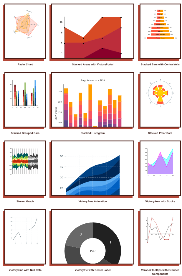
Here some examples of what it is possible to do with Victory, from the "Gallery" page of the documentation page.
https://formidable.com/open-source/victory/gallery/
Among the other libraries I found during research, react-native-chart-kit was probably the best alternative. But the last update was more than a year old, and the documentation was not as good as Victory. I also remembered having already used it for another project few years ago and that I had no choice but to create a fork of it in order to be able to achieve a specific design, something that I had not been able to do at that time due to the lack of customization possibilities.
How it is working
Every VictoryChart item must be written inside a VictoryChart container. The data have to be passed directly to the children, then the container aggregates all the data from children to determine properties like scaling, the domain or the range.
<VictoryChart>
 <VictoryLine data={data} >
 <VictoryBar data={data} >
 <... Others Victory views only ...>
</VictoryChart>
Also, it seems that there is no need to set the data parameter to each child every time, as the data from "bar" or "lines" children will be retrieved automatically. In order to add some functionalities like the zoom, scroll or else, it is possible to add to the main container a "container component".
<VictoryChart
 ...
 containerComponent={
<VictoryVoronoiContainer
 voronoiDimension="x"
 labelComponent={<VictoryTooltip />}
/>
}
>
In this example, adding VictoryVoronoiContainer adds to your chart Tooltips that are displayed when data is touched by the user.
Styles can be added to every Chart component, but have to use the Victory's style structure, like:
style={{
 data: { fill: 'tomato', opacity: 0.7 },
 labels: { fontSize: 12 },
 parent: { border: '1px solid #ccc' },
}}
Integration in Pep Up application
More recently, when redesigning the Pep Up mobile application, I had to recreate the graphics already integrated into the application. These can show different data entered by the user over selected periods, such as number of steps, calories, sleep time, blood pressure etc. The graphics for the base app were all hand-made using react-native-svg, which looked really impressive. For maintenance reasons, and because I had already used Victory on the other project, it was decided to recreate the graphics from scratch using this library while trying to preserve the original design and functionality as best as possible.
Here is the result:
 |
 |
This Daily Record (日々の記録) allows you to view your data by day (over a month), and by average over several weeks or by year. The data sets being the same regardless of the desired period, it is then necessary to use scaling tools such as D3 in order to format the data according to the periods and domains (min and max values of an X or Y axis).
Pages with two types of values must also be consistent when rendered. For blood pressure, for example, diastolic and systolic pressures share the same unit type (mmHg), but not the same min and max ranges. It is therefore necessary to ensure that the values displayed are positioned consistently with the single axis.
Problems and workarounds
During development, a certain number of problems that I encountered while using the library turned out to be quite very problematic and forced me to look for workaround solutions.
A worrying issue I encountered when using Victory was that when I started to work on the Pep Up app redesign, the library had actually been out of date for more than a year, which was not the case when I worked on a previous project. Fortunately this is not the case anymore, and about ten new patches have been released since last November which we are now using.
One issue I struggled with for a while was compatibility issues with Storybook, a UI testing tool. At that time we were using a beta version of storybook, but it was actually incompatible with the latest Victory version. Updating Storybook to the last major version fixed the issue. So sometimes the solutions turn out to be the simplest, but that was quite hard to understand as no clear error was returned.
Another issue was related to the scroll functionality. Charts in Pep Up show data for either a month, a few weeks, or an entire year. As it is not possible to display everything at once, the application displays up to ten elements then you just have to scroll horizontally to display the rest. Victory offers a Container which allows scrolling and zooming on data. This seemed to me to be a good solution as it is managed by the library itself. However, this method had a big lag issue when scrolling, even when the datasets were small. Unfortunately, this was a problem mentioned several times on library tickets, but only concerning the React Native version. Comparing with the previous Pep Up application, this seemed like a huge regression to me, so I applied a very simple solution: use a simple Scrollview component and make some style adjustments to correctly position the data, axes and background in the ScrollView.
Other minor issues disrupted the development, to the point that it was necessary to adapt the design from the original one:
For example, when the user presses on a point or a data bar, a pop-up named ToolTip which is managed by the library appears with data such as the selected value, date, labels, etc. If using the default Tooltip component is easy, the design possibilities are limited. To do this, the use of a custom tooltip using a FlyoutComponent system is necessary, which makes customization free but makes the ToolTip positioning system very approximate and imperfect.
Another issue regarding ScrollView and Y axes:
As explained above, I had to use a normal ScrollView rather than the library scroll container. In doing so, I had to include the Chart container and its children inside the ScrollView, but then there was the problem of the left and right axes, which are supposed to be stationary in relation to the scroll but which now moved with the ScrollView.
Displaying the left and right axes in a separate second chart container, outside the ScrollView but by adapting the position to absolute and only displaying the axes fixes the issue. In doing so, and because the data bar and lines must pass under the axes columns when scrolling, I had to place the container with the axes before the other container (because it is SVG, the order of the different elements is important).
This is a good thing, but because of this, the tooltips I talked about previously now appear under the axes.

The problem is solvable by displaying the tooltip above the chart at the legend level, but this requires yet another workaround for a functionality that is supposed to be simple to begin with.
Conclusion
A succession of problems solved by various workarounds, but which ultimately only cause other problems elsewhere, hence the importance of thinking about these aspects early in the design and integration of such tools. In the end, despite all these problems, a new version of the charts functionality in the Pep Up renewal is now complete, stable and visually improved.
Despite all the issues I encountered, I still think that Victory is a good library. The documentation is huge and even has many examples in the « Gallery » section. It is highly customizable, and relatively easy to use for not too complex charts. Also, as I said previously, about ten updates have been made by the maintainers since last November, which is reassuring from a stability and security point of view.
In short, before deciding on the integration of a library which will be used on an important part of your application, take the time to see the different other options available and to compare them with each other. Make sure that it is still updated regularly and recently, and remember to look at the open tickets on GitHub: If the library is drowning in unanswered tickets, take more time before deciding.
